


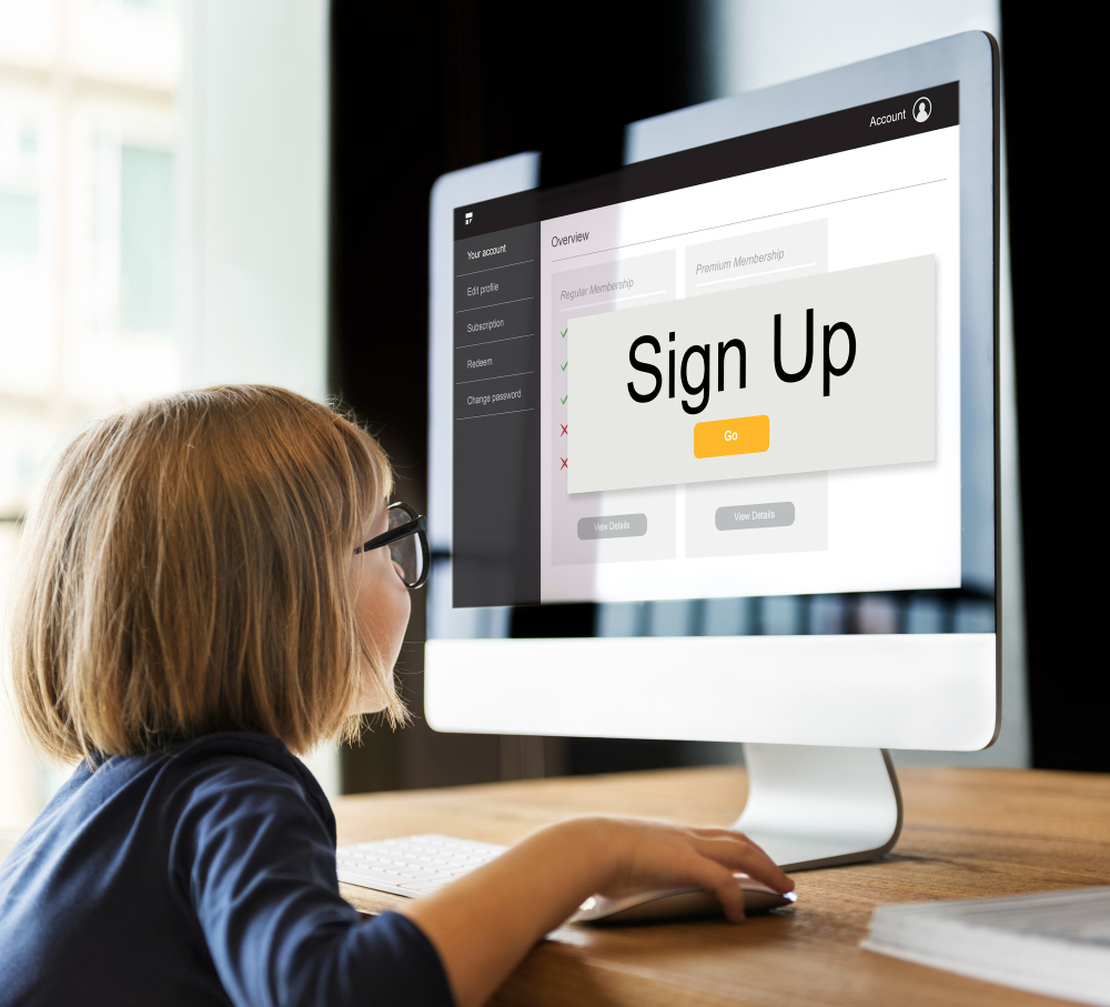
A good homepage can turn a visitor into a loyal customer. The design of your business homepage is very important for getting conversions. A study showed that redesigning HubSpot’s homepage doubled conversion rates. Practical tips can make this change possible. Good website design services can improve time on site by 84%. They can also increase yearly online revenue by 132%. You can make a homepage that attracts and converts by focusing on user experience, easy navigation, and strong CTAs.

Why Does Knowing Your Audience Matter for Better Conversion Rate Optimization?
The knowledge of the targeted group of buyers will enhance improved conversion rates. The more you are aware of audience, the more you can create your homepage in accordance to them. This makes people to spend more time in our shops, therefore buy more.
Do User Research
Surveys and Questionnaires
Surveys and questionnaires help you learn what customers like and dislike. Make surveys that match your goals for better conversions. Ask about their experience, design likes, and features they want. Feedback shows what needs fixing. Kaitlin Ortega, a CRO expert, says matching survey goals with conversion goals is important. This way, the feedback you get is useful.
User Personas
Use cases represent the various kinds of guests at your site. Such personas include the age, gender, interests, online activities, and habits of people. These create for you samples to help you arrive at the homepage that fits each group well. According to Kaitlin Ortega, persona can be employed to ensure that the given homepage meets particular needs. This gives the users the feeling that they are being attended to personally.
Study User Actions
Heatmaps
Heatmaps indicate where people click, scroll and where they put their mouse cursor in reference to your website. It allows for determining which parts of the homepage are visited most or least. Make use of the following information as you work out the layout and design parts. For example, if many people click one area often, then place buttons that are important there. Heat maps allow you to notice what users doing so that you can make the right design decisions.
Analytics Tools
Google analyses offers the enhanced insights regarding the behaviour of users on the website. Analyse such factors as bounce rate, session time and lastly page views to know more about the user’s behaviour. It also displays the basic information of the visitor such as his age or the place he is coming from. With this information, optimize your homepage response – the site people first interact with. For example, if many guests come to you with mobile devices, ensure that the loading of the homepage is possible on phones.
Research and behavioural analysis of the audience is always important. It assists in the construction of a homepage that allows the users to achieve their goals and that raises the conversion rates.

How to Make Simple Navigation with Website Design Services?
Making a user-friendly website means having simple navigation. A clear menu helps users a lot. This makes them stay longer and buy more.
Better User Experience with Clear Menus
Smart Categories
Organise your menu items into smart groups. This makes it easier for the visitors to locate things of interest in the shortest time possible. For instance, it is possible to have a main category that contains all the product types. This makes it easy to use. People will like it when they are able to find info within a short span of time. Smart categories make the visitors happy and they do not leave your site.
Clear Labels
Ensure that the words on each of the menus are easy to understand. Do not use general terms such as ‘Services’ or ‘Products’. But instead of that, you should state what you offer in clear terms such as ‘Web Design Services’ or ‘SEO Help’. This makes it easier for users to understand what they will be getting when they click on the link. This makes them happier and curious to see more.
Use Breadcrumbs
Breadcrumbs are additional navigation aids. They indicate the areas that the users are likely to be in the site. This in turn assists in enhancing the user experience.
Why Breadcrumbs Are Good
Breadcrumbs have many benefits:
- Better Navigation: Users can go back to earlier pages easily.
- Lower Bounce Rate: Visitors stay longer when it’s easy to move around.
- Better SEO: Search engines find breadcrumb links, which helps your site rank higher.
Tips for Using Breadcrumbs
To use breadcrumbs well, plan carefully:
- Placement: Put breadcrumbs at the top of the page, below the main menu.
- Order: Make sure breadcrumbs match your site’s structure.
- Clickable Links: Each breadcrumb should be clickable for easy moving around.
A good breadcrumb trail makes the user experience better by showing a clear path for users to follow.

How to Make Your Home-Page Load Faster?
Website speed is very important. A slow homepage can make people leave. Let’s see how to make your site load faster.
Shrink Images
Images look nice but can slow down your site. Shrinking images makes them smaller without losing quality. This helps your site load quickly.
Tools for Shrinking
Here are some tools to shrink images:
- TinyPNG: Makes PNG and JPEG images smaller but still good.
- ImageOptim: A tool for Mac that removes extra data from images.
- Kraken.io: Offers ways to shrink different image types without losing much quality.
Using these tools can really speed up your site.
Tips for Better Images
Follow these tips to make your images better:
- Pick the Right Type: Use JPEG for photos and PNG for clear backgrounds.
- Resize Images: Make sure images aren’t bigger than needed.
- Lazy Loading: Load images only when they come into view. This helps with initial loading times.
A study by Tushar Kanjariya showed that shrinking images helps a lot with website speed. Doing this will help your site load faster.
Reduce HTTP Requests
Any picture and scripts on your homepage require an HTTP request as does every other part of it. Less requests equal a quicker page.
Combine Files
PutThis means that when many files are placed in one, the number of HTTP requests reduces. For instance, combine all the CSS files into one file. The same should be done with JavaScript files. This makes loading to be easier and faster.
Use CDNs
CDNs distribute your site’s content on many servers around the globe. When a user accesses a site, the CDN delivers the content from the nearest server and this is faster.
Some popular CDNs are:
- Cloudflare
- Amazon CloudFront
- Akamai
When content is delivered through a CDN, it is faster and the experience of the users is enhanced.
You can also make your website load faster by making images smaller and by minimizing the number of HTTP requests. These steps will enhance the usability and thus boost the conversion rates among the users.

How to Use Good Visuals to Make Great Website Pages?
A good fun homepage is one which has good visuals. They attract attention and cause people to remain longer. Now let’s see how to use visuals well to enhance your homepage and increase sales.
Why Are Good Photos Important for More Sales?
As we know, good photos can really boost up the sales. Good pictures are important to provide a first impression and to make people believe in you.
Hiring Photographers
Hiring photographers means that your pictures will be unique and will suit your brand. They understand how to market your products or services in the best manner possible. Good photos enhance the neat and real appearance of your homepage. Money spent on good photography can attract more visitors and sales.
Stock Photos
This is cheaper than hiring photographers for the event or for the day of the shoot. Most of the sites have good stock images that you can use on your homepage. There are many free stock photo websites such as Unsplash and Pexels. These can be useful in that they are cheaper and faster than other options but still present a good image. Just make sure the photos match your brand.
Keep Branding the Same
Maintaining the same style on your homepage is professional. It reminds people of who you are.
Colour Schemes
Choose colours that depict what your brand is all about. Use these colours anywhere on your homepage for a neat look. It is for this reason that colours are known to influence how people feel and even behave. For instance, blue means trust and red means that it is urgent. It is better to avoid having too much colours on the website so that it does not over-power the visitors.
Typography
Typography is crucial in creating a good-looking homepage. Choose fonts that are readable and that are in line with your brand’s personality. Make some of the fonts larger and some of them smaller and some of them bold and some of them thin to indicate what is a priority. The key information is underlined by means of using bold or big fonts. Appropriate and coherent typographical design helps to read and maintain the attention of the audience.

How do you write catchy headlines to attract users from Google search results?
Writing catchy headlines can help attract users from Google. A good headline grabs attention and gets clicks. Let’s see how to do this well.
Use Power Words
Strong words create feelings and make people act. These words make your headlines more interesting.
Examples of Strong Words
Here are some strong words:
- Free
- Instant
- Proven
- Exclusive
- Guaranteed
- Top
- Best
Using these words makes your headlines better. For example, “Get Instant Access to Exclusive Tips” is more exciting than “Access Tips”.
Where to Put Strong Words
Where you put strong words matters; put them at the start or end of your headline for best results. For example, “Exclusive: Proven Tips for Better Conversions” or “Proven Tips for Better Conversions – Exclusive Guide”. This catches the reader’s eye fast.
Rank Math, an SEO expert, has a tool to check headlines for strong words. This shows how important using these words is.
Keep It Short and Simple
Short and simple headlines work best. Long ones can lose readers’ interest. Aim for clear and concise headlines.
Best Length
The best length for a headline is about 6-8 words. This keeps it clear and engaging. For example, “Boost Your Sales with These Tips” is short and clear.
Test Your Headlines
Testing different headlines helps find the best one. Use A/B testing to compare which works better. Tools like Google Optimize or Optimizely can help with this. Testing improves your approach and results.
How do you implement clear CTAs on your homepage during website design?
A good homepage needs clear Call-to-Actions (CTAs). These guide visitors to act. Good CTAs turn visitors into customers. Let’s see how to place and write CTAs well.
Where to Put CTAs
At the Top
Put key CTAs at the top. This means placing them where visitors see them first. People decide fast whether to stay or leave. A clear CTA makes them act quickly. For example, a “Sign Up Now” button at the top grabs attention.
After Content
Put CTAs after content, too. After reading or viewing, visitors need a next step. A CTA here tells them what to do next. For example, after a blog post, a “Read More” or “Contact Us” button keeps them interested.
Using Action Words
Examples of Good CTAs
Use strong action words in CTAs. Words like “Get,” “Start,” and “Discover” make people act. For example:
- “Get Your Free Guide”
- “Start Your Free Trial”
- “Discover Our Services”
Personalized CTAs work 202% better than plain ones. Make your CTAs fit your audience for the best results. For instance, “Get Your Free Guide” works better than just “Download Guide.”
Testing Different CTAs
Test different CTAs to find the best one. A/B testing compares two versions to see which is better. Use tools like Google Optimize or Optimizely for this test. Try different words, colours, and places for your CTA buttons. For example, test “Start Your Free Trial” against “Begin Your Free Trial.” Pick the one that gets more clicks.

How does social proof get more people to buy from your website?
Social proof helps build trust and get more sales. Customer testimonials and case studies are great tools. Let’s see how to use them well.
Customer Testimonials
Customer testimonials show real experiences with your company. They act as social proof, showing new customers the value of your services.
Getting Testimonials
Getting testimonials means asking happy customers for feedback. Make it easy with a simple form or questions. Offer discounts or freebies to encourage them.
“Customer testimonials can be very useful on your website and other online channels as they act as a form of social proof.”
Showing Testimonials
Showing testimonials in the right places can boost sales. Put them on your homepage, near CTAs, or product pages. Use video testimonials to show real customer stories. Video testimonials can increase sales by 86%. Highlight key phrases in bold to grab attention.
“Testimonial videos on sales pages increase conversions by 80%.”
Case Studies
Case studies tell detailed success stories. They show how your services solve problems and work well.
Writing Case Studies
Writing case studies has steps. Start with a clear problem statement. Explain the customer’s challenges and how you solved them. Use data to show results. Add quotes from the customer for authenticity.
“By showing that other people have had positive experiences with your offer, you can reduce the perceived risk and increase the perceived value of your product or service.”
Showing Results
Showing results makes case studies strong. Use bullet points for key achievements. Show before-and-after comparisons for improvements. Use charts and graphs to make data easy to understand.
“Social proof and testimonials are important because they can help you overcome the scepticism and resistance of your potential customers.”
Using social proof through testimonials and case studies can greatly improve your website’s conversion rates. These tools build trust and show how good your services are.

How to Boost Your Conversion Rate with Mobile Responsiveness?
Mobile responsiveness can really help your website’s conversion rates. A responsive design means users have a smooth experience on any device. Let’s see how to use responsive design and test it for mobile friendliness.
Use Responsive Design Principles
Responsive design makes sure your website fits all screen sizes and devices. This improves user experience and boosts conversions.
Fluid Grids
Fluid grids use percentages instead of fixed sizes like pixels. This helps the layout fit any screen size. For example, setting a width to 50% makes it half the screen on both desktop and mobile. Fluid grids make layouts flexible and user-friendly.
Flexible Images
Flexible images resize within their containers. This stops images from breaking the layout or being too big on small screens. Use CSS to set the image width to 100%. This keeps images looking good while fitting the screen size. Flexible images make designs look nice and work well.
Test for Mobile-Friendliness
Testing your site for mobile-friendliness is very important. It finds problems that can hurt user experience and conversions.
Tools for Testing
Here are some tools to test mobile responsiveness:
- Google Mobile-Friendly Test: Checks your site’s mobile usability.
- BrowserStack: Tests your site on different devices and browsers.
- Responsinator: Shows how your site looks on various screens.
These tools help ensure your site works well on all devices.
Common Issues and Fixes
Mobile testing often shows common issues:
- Slow Loading Times: Mobile users want fast pages. Optimize images and reduce HTTP requests to speed up loading.
- Touchscreen Navigation: Make buttons big enough for easy tapping. Keep interactive elements spaced out.
- Readability: Text should be easy to read without zooming in. Use at least 16px font size and good contrast between text and background.
Fixing these issues improves the mobile user experience and boosts conversions.
A study found that sites loading in two seconds or less see a 15% rise in mobile conversions. People are 37% more likely to buy from a mobile-friendly site. By using responsive design principles and thorough testing, you can optimize your site for better conversions.
How to Use & Optimize White Space on Your Services Page?
White space, also called negative space, is key in web design. Using white space well can make your site better and get more sales.
Let’s see how to use white space, right?
Avoid Clutter for Better Conversions
Cluttered pages confuse visitors. A clean page helps users focus on important parts.
Focus on Important Content
Make sure the most important info stands out. Put key things like headlines and CTAs where they are easy to see. Arrange other content in a way that guides users through the page.
Apple does this well. Their product pages use white space to highlight the main features. This makes the content more interesting and easier to read.
Visual Order
Visual order arranges content by what’s most important. Bigger fonts and bright colours show key info. Smaller fonts and lighter colours show less important info.
In the 1920s, new design ideas used white space smartly. These ideas help make a clear visual order, making it easier for users to find their way around the page.
Make Text Easy to Read
Good readability keeps visitors interested. White space makes text easier to read.
Line Spacing
Proper line spacing makes text clear. Enough space between lines stops text from looking crowded. Aim for a line height of 1.5 times the font size for best readability.
Beatrice Warde’s essay, ‘The Crystal Goblet’, talked about clear typography’s importance. Follow her advice: good line spacing improves reading experience.
Margins and Padding
Margins and padding give breathing room around elements. Margins separate sections; padding adds space within elements. Both improve layout and make the page inviting.
Skype’s website redesign showed how powerful white space is. The redesign improved visual order and whitespace, making it user-friendly.
By avoiding clutter and improving readability, you can use white space well. These steps will make your services page more engaging and better at getting conversions.

How to Improve Conversion Rates by Publishing, Updating, and Optimizing Your Content?
New Blog Posts
Writing new blog posts can help increase your conversion rate. Regular updates keep readers interested and bring in new visitors.
Content Calendar
A content calendar helps you plan your blog posts. It makes sure you post regularly and stay organized.
- Set Goals: Decide what you want from your blog, like more traffic or engagement.
- Schedule Posts: Plan your posts for the month with dates and topics.
- Track Performance: Watch how each post does and change your plan if needed.
A good content calendar keeps your blog active and interesting.
Topic Ideas
Picking the right topics is key to keeping readers engaged. Focus on what interests them and fits your goals.
- Answer Common Questions: Address questions your audience often asks to build trust.
- Industry News: Share updates in your field to keep content fresh.
- How-To Guides: Give step-by-step guides on useful topics that engage readers.
Updating your blog with new content keeps people coming back.
Update Old Pages
Updating old pages makes them work better and keeps them relevant. Regular updates show search engines that your site is current.
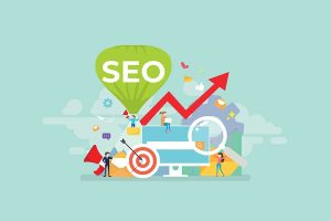
SEO Best Practices
Optimizing for search engines helps more people find you online.
- Keyword Research: Find keywords related to your content using tools like Google Keyword Planner.
- On-Page SEO: Use keywords in titles, headings, and meta descriptions; make sure the content is easy to read.
- Internal Linking: Link to other pages on your site to improve navigation and keep visitors engaged.
Following these steps helps your content rank higher in searches.
Keeping Information Current
Old information can hurt trust. Review and update content often for accuracy.
- Check Facts: Make sure all facts are up-to-date.
- Update Links: Ensure all links work correctly.
- Refresh Visuals: Replace old images with high-quality ones for a better user experience.
Keeping info current maintains trust and improves user satisfaction.
Here are ten tips to make your homepage better for more conversions. Use these tips to see significant changes in user interest and conversion rates.
- Know your audience.
- Make navigation simple.
- Speed up loading time.
- Use good visuals.
- Write catchy headlines.
- Have clear CTAs.
- Show social proof.
- Make it mobile-friendly.
- Use white space well.
- Update content often.
Start today! Use these ideas to get more conversions. For expert help, try CK Website Design’s Homepage Services. Turn your homepage into a strong tool for conversions.


")


")
")


